KDP(電子出版)のメモ 急急如律令

Amazon Kindleダイレクト・パブリッシングでの電子出版や電子書籍の作成販売について、文章やイラストの作成や編集方法について書いています。

AozoraEpub3の電書協css対応作業5 傍線


99nyorituryo.hatenablog.com


border-right-styleかtext-decoration

AozoraEpub3ではborder-right-styleとborder-bottom-styleで書かれていて、電書協ではtext-decorationが使われている。ほかに、AozoraEpub3では線の太さを1pxで指定されている。電書協では傍線は、右と左の線しか指定されていないが、カラーが追加されている。


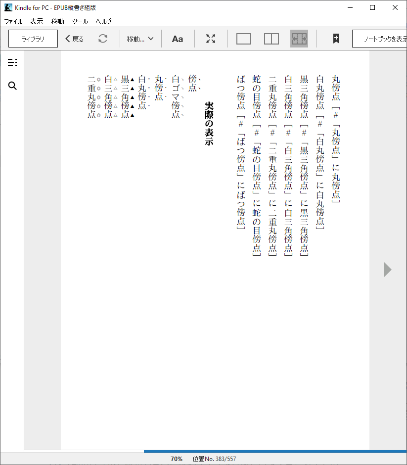
 気になるのが、傍線は横書きのときは下線になる。縦書きのときは右線になる。青空文庫の左に二重傍線、左に鎖線、左に破線、左に波線がAozoraEpub3になかった。追加してもいいがどれくらいの端末で動くかが把握できない。


 青空文庫にはないけど打消し線を追加するのもいいかもしれない。

<div style="text-decoration:line-through">打ち消し線</div>

www.tohoho-web.com

電書協

<p><span class="em-line">あいアイ安以ABab12!?ABab12!?</span> &lt;span&gt;に指定</p>

/* 【横組み】下線 【縦組み】右線 */
.hltr .em-line {
text-decoration: underline;
}
.vrtl .em-line {
text-decoration: overline;
}

/* 【横組み】上線 【縦組み】左線 */
.hltr .em-line-outside {
text-decoration: overline;
}
.vrtl .em-line-outside {
text-decoration: underline;
}


AozoraEpub3

縦書き

/* 傍線 */
span.underline, span.double_underline, span.dotted_underline, span.dashed_underline, span.wave_underline {
border-right-width: 1px;
padding-right: 1px;
}
span.underline {
border-right-style: solid;
}
span.double_underline {
border-right-width: 3px;
border-right-style: double;
}
span.dotted_underline {
border-right-style: dotted;
}
span.dashed_underline {
border-right-style: dashed;
}
span.wave_underline {
border-right-style: solid;/*wave;*/
}
span.left_underline {
border-left-style: solid;
padding-left: 1px;
border-left-width: 1px;
}

横書き

/* 傍線 */
span.underline, span.double_underline, span.dotted_underline, span.dashed_underline, span.wave_underline {
border-bottom-width: 1px;
padding-bottom: 1px;
}
span.underline {
border-bottom-style: solid;
}
span.double_underline {
border-bottom-width: 3px;
border-bottom-style: double;
}
span.dotted_underline {
border-bottom-style: dotted;
}
span.dashed_underline {
border-bottom-style: dashed;
}
span.wave_underline {
border-bottom-style: solid;/*wave;*/
}
span.left_underline {
border-top-style: solid;
padding-top: 1px;
border-top-width: 1px;
}


####傍線 (すべて傍線と同じ表現)

####傍線 (すべて傍線と同じ表現)

傍線 <span class="underline">

傍線終わり </span>

二重傍線 <span class="double_underline">

二重傍線終わり </span>

鎖線 <span class="dotted_underline">

鎖線終わり </span>

破線 <span class="dashed_underline">

破線終わり </span>

波線 <span class="wave_underline">

波線終わり </span>
左に傍線 <span class="left_underline">

左に傍線終わり </span>


変更後

 試しに赤線を追加してみる。

/* 横組み打ち消し線
---------------------------------------------------------------- */
.line-through {
text-decoration: line-through;
}

/* 【横組み】下線  */
.em-line {
text-decoration: underline;
}
/* 【横組み】上線  */
.em-line-outside {
text-decoration: overline;
}
/* 【横組み】二重線 */
double_underline {
text-decoration:underline double;
}
/* 【横組み】鎖線 */
dotted_underline {
text-decoration:underline dotted;
}
/* 【横組み】破線 */
dashed_underline {
text-decoration:underline dashed;
}
/* 【横組み】波線 */
wave_underline {
text-decoration:underline wavy;
}
/* 【横組み】赤線 */
line-red {
text-decoration:underline red;
}
/* 【横組み】左に二重傍線 */
left_double_underline {
text-decoration:overline double;
}
/* 【横組み】左に鎖線 */
left_dotted_underline {
text-decoration:overline dotted;
}
/* 【横組み】左に破線 */
left_dashed_underline {
text-decoration:overline dotted;
}
/* 【横組み】左に波線 */
left_wave_underline {
text-decoration:overline wavy;
}
/* 【横組み】左に赤線 */
left-line-red {
text-decoration:overline red;
}


/*縦書き 打ち消し線
---------------------------------------------------------------- */
.line-through {
text-decoration: line-through;
}

/* 【縦組み】右線 */
.em-line {
text-decoration: overline;
}
/* 【縦組み】左線 */
.em-line-outside {
text-decoration: underline;
}
/* 【縦組み】二重線 */
double_underline {
text-decoration:overline double;
}
/* 【縦組み】鎖線 */
dotted_underline {
text-decoration:overline dotted;
}
/* 【縦組み】破線 */
dashed_underline {
text-decoration:overline dashed;
}
/* 【縦組み】波線 */
wave_underline {
text-decoration:overline wavy;
}
/* 【縦組み】赤線 */
line-red {
text-decoration:overline red;
}
/* 【縦組み】左に二重傍線 */
left_double_underline {
text-decoration:underline double;
}
/* 【縦組み】左に鎖線 */
left_dotted_underline {
text-decoration:underline dotted;
}
/* 【縦組み】左に破線 */
left_dashed_underline {
text-decoration:underline dotted;
}
/* 【縦組み】左に波線 */
left_wave_underline {
text-decoration:underline wavy;
}
/* 【縦組み】左に赤線 */
left-line-red {
text-decoration:underline red;
}


縦書き用


/* 打ち消し線
---------------------------------------------------------------- */
.line-through {
text-decoration: line-through;
}

/* 【縦組み】右線 */
.vrtl .em-line {
text-decoration: overline;
}
/* 【縦組み】左線 */
.vrtl .em-line-outside {
text-decoration: underline;
}
/* 【縦組み】二重線 */
double_underline {
text-decoration:overline double;
}
/* 【縦組み】鎖線 */
dotted_underline {
text-decoration:overline dotted;
}
/* 【縦組み】破線 */
dashed_underline {
text-decoration:overline dashed;
}
/* 【縦組み】波線 */
wave_underline {
text-decoration:overline wavy;
}
/* 【縦組み】赤線 */
line-red {
text-decoration:overline red;
}
/* 【縦組み】左に二重傍線 */
left_double_underline {
text-decoration:underline double;
}
/* 【縦組み】左に鎖線 */
left_dotted_underline {
text-decoration:underline dotted;
}
/* 【縦組み】左に破線 */
left_dashed_underline {
text-decoration:underline dotted;
}
/* 【縦組み】左に波線 */
left_wave_underline {
text-decoration:underline wavy;
}
/* 【縦組み】左に赤線 */
left-line-red {
text-decoration:underline red;
}


####傍線 (すべて傍線と同じ表現)

####傍線 (すべて傍線と同じ表現)

傍線 <span class="em-line">

傍線終わり </span>

二重傍線 <span class="double_underline">

二重傍線終わり </span>

鎖線 <span class="dotted_underline">

鎖線終わり </span>

破線 <span class="dashed_underline">

破線終わり </span>

波線 <span class="wave_underline">

波線終わり </span>
左に傍線 <span class="em-line-outside">

左に傍線終わり </span>

左に二重傍線 <span class="left_double_underline">

左に二重傍線終わり </span>

左に鎖線 <span class="left_dotted_underline">

左に鎖線終わり </span>

左に破線 <span class="left_dashed_underline">

左に破線終わり </span>

左に波線 <span class="left_wave_underline">

左に波線終わり </span>
打ち消し線 <span class="line-through">

打ち消し線終わり </span>

赤線 <span class="line-red">

赤線 <span class="line-red">

赤線終わり </span>

左に赤線 <span class="left-line-red">

左に赤線終わり </span>

AozoraEpub3の電書協css対応作業4 傍点、圏点

 HTMLだと普通はemタグを使うのだけど、電書協ではemタグではなくspanタグで書かれていた。AozoraEpub3もspanタグを使っているので変更箇所はclass名とstylesheetかな。emはEmphasisの略で強調という意味。

f:id:kyukyunyorituryo:20211109233736p:plain

傍点


電書協

<p>ゴマ点→この<span class="em-sesame">例の文章</span>は<span class="em-sesame-open">サンプル</span>です(em-sesame [-open])</p>


.em-sesame {
-webkit-text-emphasis-style: filled sesame;
-epub-text-emphasis-style: filled sesame;
}


AozoraEpub3

<span class="sesame"> 傍点 </span>


span.sesame {
text-emphasis-style: sesame;
-webkit-text-emphasis-style: sesame;
-epub-text-emphasis-style: sesame;
}

スタイルシートの書き方を見ると、AozoraEpub3ではspanタグ内だけに限定している。


変更後

/* 圏点 */
/* 傍点 */
/*
span.sesame {
text-emphasis-style: sesame;
-webkit-text-emphasis-style: sesame;
-epub-text-emphasis-style: sesame;
}
span.open_sesame {
text-emphasis-style: open sesame;
-webkit-text-emphasis-style: open sesame;
-epub-text-emphasis-style: open sesame;
}
span.dot {
text-emphasis-style: dot;
-webkit-text-emphasis-style: dot;
-epub-text-emphasis-style: dot;
}
span.open_dot {
text-emphasis-style: open dot;
-webkit-text-emphasis-style: open dot;
-epub-text-emphasis-style: open dot;
}
span.circle {
text-emphasis-style: circle;
-webkit-text-emphasis-style: circle;
-epub-text-emphasis-style: circle;
}
span.open_circle {
text-emphasis-style: open circle;
-webkit-text-emphasis-style: open circle;
-epub-text-emphasis-style: open circle;
}
span.double-circle {
text-emphasis-style: double-circle;
-webkit-text-emphasis-style: double-circle;
-epub-text-emphasis-style: double-circle;
}
span.open_double-circle {
text-emphasis-style: open double-circle;
-webkit-text-emphasis-style: open double-circle;
-epub-text-emphasis-style: open double-circle;
}
span.triangle {
text-emphasis-style: triangle;
-webkit-text-emphasis-style: triangle;
-epub-text-emphasis-style: triangle;
}
span.open_triangle {
text-emphasis-style: open triangle;
-webkit-text-emphasis-style: open triangle;
-epub-text-emphasis-style: open triangle;
}
*/
/* 圏点・傍点
---------------------------------------------------------------- */
.em-sesame {
-webkit-text-emphasis-style: filled sesame;
-epub-text-emphasis-style: filled sesame;
}
.em-sesame-open {
-webkit-text-emphasis-style: open sesame;
-epub-text-emphasis-style: open sesame;
}
.em-dot {
-webkit-text-emphasis-style: filled dot;
-epub-text-emphasis-style: filled dot;
}
.em-dot-open {
-webkit-text-emphasis-style: open dot;
-epub-text-emphasis-style: open dot;
}
.em-circle {
-webkit-text-emphasis-style: filled circle;
-epub-text-emphasis-style: filled circle;
}
.em-circle-open {
-webkit-text-emphasis-style: open circle;
-epub-text-emphasis-style: open circle;
}
.em-double-circle {
-webkit-text-emphasis-style: filled double-circle;
-epub-text-emphasis-style: filled double-circle;
}
.em-double-circle-open {
-webkit-text-emphasis-style: open double-circle;
-epub-text-emphasis-style: open double-circle;
}
.em-triangle {
-webkit-text-emphasis-style: filled triangle;
-epub-text-emphasis-style: filled triangle;
}
.em-triangle-open {
-webkit-text-emphasis-style: open triangle;
-epub-text-emphasis-style: open triangle;
}

span.x-dot {
text-emphasis-style: '×';
-webkit-text-emphasis-style: '×';
-epub-text-emphasis-style: '×';
}
span.left_emp {
text-emphasis-position: under;
-webkit-text-emphasis-position: under;
-epub-text-emphasis-position: under;
}

chuki_tag.txt

############## 強調 ##############
####圏点
傍点 <span class="em-sesame"> 2
傍点終わり </span> 3

白ゴマ傍点 <span class="em-sesame-open"> 2
白ゴマ傍点終わり </span> 3

丸傍点 <span class="em-dot"> 2
丸傍点終わり </span> 3

白丸傍点 <span class="em-dot-open"> 2
白丸傍点終わり </span> 3

黒三角傍点 <span class="em-triangle"> 2
黒三角傍点終わり </span> 3

白三角傍点 <span class="em-triangle-open"> 2
白三角傍点終わり </span> 3

二重丸傍点 <span class="em-double-circle-open"> 2
二重丸傍点終わり </span> 3

蛇の目傍点 <span class="em-double-circle"> 2
蛇の目傍点終わり </span> 3

ばつ傍点 <span class="x-dot"> 2
ばつ傍点終わり </span> 3
×傍点 <span class="x-dot"> 2
×傍点終わり </span> 3

左に傍点 <span class="left_emp em-sesame"> 2
左に傍点終わり </span> 3

左に白ゴマ傍点 <span class="left_emp em-sesame-open"> 2
左に白ゴマ傍点終わり </span> 3

左に丸傍点 <span class="left_emp em-dot"> 2
左に丸傍点終わり </span> 3

左に白丸傍点 <span class="left_emp em-dot-open"> 2
左に白丸傍点終わり </span> 3

左に黒三角傍点 <span class="left_emp em-triangle"> 2
左に黒三角傍点終わり </span> 3

左に白三角傍点 <span class="left_emp em-triangle-open"> 2
左に白三角傍点終わり </span> 3

左に二重丸傍点 <span class="left_emp em-double-circle-open"> 2
左に二重丸傍点終わり </span> 3

左に蛇の目傍点 <span class="left_emp em-double-circle"> 2
左に蛇の目傍点終わり </span> 3

左にばつ傍点 <span class="left_emp x-dot"> 2
左にばつ傍点終わり </span> 3
左に×傍点 <span class="left_emp x-dot"> 2
左に×傍点終わり </span> 3


AozoraEpub3の電書協css対応作業3 見出し、フォントサイズ、小書き

 見出し部分でchap1を使っているところやfont3などでフォントサイズを書き換えた。

AozoraEpub3では見出しがh1ではなくdivになっていたので、htmlっぽくないな感じたので変えてみた。ただ、後で問題がないかよく確認する必要がある。


青空文庫の特徴として見出しの種類が多い、電書協に対応例がないので考える必要がある。

www.aozora.gr.jp

############# 見出し #############
ここから大見出し <div class="chap1"> 1
ここで大見出し終わり </div> 1
ここから中見出し <div class="chap2"> 1
ここで中見出し終わり </div> 1
ここから小見出し <div class="chap3"> 1
ここで小見出し終わり </div> 1
###見出し注記は自動で閉じる(見出し終わり注記ではタグは定義しない)
見出し <div class="chap1"> </div> 1
見出し終わり 1
大見出し <div class="chap1"> </div> 1
大見出し終わり 1
中見出し <div class="chap2"> </div> 1
中見出し終わり 1
小見出し <div class="chap3"> </div> 1
小見出し終わり 1
同行大見出し <span class="font5">
同行大見出し終わり </span>
同行中見出し <span class="font3">
同行中見出し終わり </span>
同行小見出し <span class="font1">
同行小見出し終わり </span>
窓大見出し <span class="mado L">
窓大見出し終わり </span>
窓中見出し <span class="mado M">
窓中見出し終わり </span>
小見出し <span class="mado S">
小見出し終わり </span>

 /* 窓見出し 行頭2行のみ対応 */
span.mado {
float: left;
display: inline-block;
line-height: 1em;
}
/* 窓見出し 左右paddingは (lineheight-文字サイズ/2)/文字サイズ */
span.mado.L { font-size:1.5em; padding:0 0.625em 0.33em 0; line-height:1em;}
span.mado.M { font-size:1.3em; padding:0 0.846em 0.38em 0; line-height:1em;}
span.mado.S { font-size:1.1em; padding:0 1.091em 0.45em 0; line-height:1em;}


下のように書き換えた

 フォントサイズを電書協にあったfont-1emという書き方に合わせている。oo-midashiの指定もあったが、cssをそのまま置き換えるには不便だと感じたので使っていない。


############# 見出し #############
ここから大見出し <h1 class="font-1em50"> 1
ここで大見出し終わり </h1> 1
ここから中見出し <h2 class="font-1em30"> 1
ここで中見出し終わり </h2> 1
ここから小見出し <h3 class="font-1em10"> 1
ここで小見出し終わり </h3> 1
###見出し注記は自動で閉じる(見出し終わり注記ではタグは定義しない)
見出し <h1 class="font-1em50"> </h1> 1
見出し終わり 1
大見出し <h1 class="font-1em50"> </h1> 1
大見出し終わり 1
中見出し <h2 class="font-1em30"> </h2> 1
中見出し終わり 1
小見出し <h3 class="font-1em10"> </h3> 1
小見出し終わり 1
同行大見出し <span class="font-1em50"">
同行大見出し終わり </span>
同行中見出し <span class="font-1em30">
同行中見出し終わり </span>
同行小見出し <span class="font-1em10">
同行小見出し終わり </span>
窓大見出し <span class="mado L">
窓大見出し終わり </span>
窓中見出し <span class="mado M">
窓中見出し終わり </span>
小見出し <span class="mado S">
小見出し終わり </span>


フォントサイズ

AozoraEpub3では段階大きな文字は110から160まで段階的に大きくする。

逆に段階小さな文字90、83、77、70、66、62と小さくする。そのために、したのCSSが追加する必要がある。電書協ではこういう中途半端なものがなかった。


/* AozoraEpub3用フォントサイズ(%指定) */
.font-0em83 { font-size: 0.83em; }
.font-0em77 { font-size: 0.77em; }
.font-0em66 { font-size: 0.66em; }
.font-0em62 { font-size: 0.62em; }


AozoraEpub3での指定方法を電書協に入れ替えた。

####文字サイズ
1段階大きな文字 <span class="font1">
2段階大きな文字 <span class="font2">
3段階大きな文字 <span class="font3">
4段階大きな文字 <span class="font4">
5段階大きな文字 <span class="font5">
6段階大きな文字 <span class="font6">
大きな文字終わり </span>
ここから1段階大きな文字 <div class="font1"> 1
ここから2段階大きな文字 <div class="font2"> 1
ここから3段階大きな文字 <div class="font3"> 1
ここから4段階大きな文字 <div class="font4"> 1
ここから5段階大きな文字 <div class="font5"> 1
ここから6段階大きな文字 <div class="font6"> 1
ここで大きな文字終わり </div> 1
1段階小さな文字 <span class="font-1">
2段階小さな文字 <span class="font-2">
3段階小さな文字 <span class="font-3">
4段階小さな文字 <span class="font-4">
5段階小さな文字 <span class="font-5">
6段階小さな文字 <span class="font-6">
小さな文字終わり </span>
ここから1段階小さな文字 <div class="font-1"> 1
ここから2段階小さな文字 <div class="font-2"> 1
ここから3段階小さな文字 <div class="font-3"> 1
ここから4段階小さな文字 <div class="font-4"> 1
ここから5段階小さな文字 <div class="font-5"> 1
ここから6段階小さな文字 <div class="font-6"> 1
ここで小さな文字終わり </div> 1


##間にpタグが入るのでブロック注記同様divにする

##間にpタグが入るのでブロック注記同様divにする

表題前 <div class="font5"> 1

表題後 </div> 1

原題前 <div class="font4"> 1

原題後 </div> 1

副題前 <div class="pt2 font2"> 1

副題後 </div> 1

副原題前 <div class="pt2 font2"> 1

副原題後 </div> 1

著者前 <div class="btm pb2 font1"> 1

著者後 </div> 1

副著者前 <div class="btm pb2 font1"> 1

副著者後 </div> 1


変更後


####文字サイズ

1段階大きな文字 <span class="font-1em10">

2段階大きな文字 <span class="font-1em20">

3段階大きな文字 <span class="font-1em30">

4段階大きな文字 <span class="font-1em40">

5段階大きな文字 <span class="font-1em50">

6段階大きな文字 <span class="font-1em60">

大きな文字終わり </span>

ここから1段階大きな文字 <div class="font-1em10"> 1

ここから2段階大きな文字 <div class="font-1em20"> 1

ここから3段階大きな文字 <div class="font-1em30"> 1

ここから4段階大きな文字 <div class="font-1em40"> 1

ここから5段階大きな文字 <div class="font-1em50"> 1

ここから6段階大きな文字 <div class="font-1em60"> 1

ここで大きな文字終わり </div> 1

1段階小さな文字 <span class="font-0em90">

2段階小さな文字 <span class="font-0em83">

3段階小さな文字 <span class="font-0em77">

4段階小さな文字 <span class="font-0em70">

5段階小さな文字 <span class="font-0em66">

6段階小さな文字 <span class="font-0em62">

小さな文字終わり </span>

ここから1段階小さな文字 <div class="font-0em90"> 1

ここから2段階小さな文字 <div class="font-0em83"> 1

ここから3段階小さな文字 <div class="font-0em77"> 1

ここから4段階小さな文字 <div class="font-0em70"> 1

ここから5段階小さな文字 <div class="font-0em66"> 1

ここから6段階小さな文字 <div class="font-0em62"> 1

ここで小さな文字終わり </div> 1


##間にpタグが入るのでブロック注記同様divにする

##間にpタグが入るのでブロック注記同様divにする

表題前 <div class="font-1em50"> 1

表題後 </div> 1

原題前 <div class="font-1em40"> 1

原題後 </div> 1

副題前 <div class="pt2 font-1em20"> 1

副題後 </div> 1

副原題前 <div class="pt2 font-1em20"> 1

副原題後 </div> 1

著者前 <div class="btm pb2 font-1em10"> 1

著者後 </div> 1

副著者前 <div class="btm pb2 font-1em10"> 1

副著者後 </div> 1


小書きの書き換え

####小書き

行右小書き <span class="super">

行右小書き終わり </span>

行左小書き <span class="sub">

行左小書き終わり </span>

上付き小文字 <span class="super">

上付き小文字終わり </span>

下付き小文字 <span class="sub">

下付き小文字終わり </span>

小書き <span class="kogaki">

小書き終わり </span>


/* 小書き文字
----------------------------------------------------------------
通常の文字を「ぁゃっ」のような小書き文字に見せるための指定
---------------------------------------------------------------- */
.kogaki {
font-size: 0.75em;
}

/* 【縦組み】右上 */
.vrtl .kogaki {
padding: 0.1em 0 0.15em 0;
vertical-align: super;
}

AozoraEpub3の電書協css対応作業2 縦書き横書き、見出し、フォントサイズ

縦書き横書き

電書協のEPUBで気になったのがhtmlタグ自体にclass指定をして、vtrlやhltrで縦書き横書きを切り替えている。

<html
xmlns="http://www.w3.org/1999/xhtml"
xmlns:epub="http://www.idpf.org/2007/ops"
xml:lang="ja"
class="vrtl"
>

AozoraEpub3では

<link rel="stylesheet" type="text/css" href="../css/vertical.css"/>や 

<link rel="stylesheet" type="text/css" href="../css/horizontal.css"/>のようにスタイルシートを読み込むことでページを縦書きか横書きかを切り替えている。

 スタイルシートの読み込みがどちらがめんどくさくないかを考えると、電書協のほうが合理的かなと思う。

ただ、それをするには、書き換えないといけない部分が多い。


 以前やったのは縦書き部分のCSSと横書き部分のCSSを個別に書き換えていた。

99nyorituryo.hatenablog.com


見出し

電書協サンプルでh1タグをどのように使うかを見ていくと、こうなっていた。

この前見たoomidashiというのはあるにはあったけどスタイルシートが空であった。つまりまだ決めていないのかなというところ。font-1em50というのが1.5倍の文字の大きさ。


<h1><span class="font-1em50">配置の基礎確認</span></h1>

.font-1em50 { font-size: 1.50em; }


 青空文庫の大見出しがh1に相当するかどうかはしらないけど。青空文庫組版案内ではどうなっているかを見ていると。大見出しがh3、中見出しがh4、小見出しがh5だった。<h3 class="o-midashi">

kumihan.aozora.gr.jp

AozoraEpub3では大見出しが150%、中見出しが130%、小見出しが110となっている。


 書かれていないということは勝手に決めていいよねってことで、

<h1 class="oo-midashi">大見出し</h1>か<h1 class="font-1em50">大見出し</h1>

 <h2 class="naka-midashi">中見出し</h2>か<h2 class="font-1em30">中見出し</h2>

 <h3 class="ko-midashi">小見出し</h3>か<h3 class="font-1em10">小見出し</h3>

/* 見出しのデフォルト書体指定
---------------------------------------------------------------- */
/* 横組み用 */
h1,
h2,
h3,
h4,
h5,
h6 {
font-family: serif-ja, serif;
}
/* 縦組み用 */
h1,
h2,
h3,
h4,
h5,
h6 {
font-family: serif-ja-v, serif-ja, serif;
}

/* 大見出し */
.oo-midashi {
}

/* フォントサイズ(%指定) */
.font-050per { font-size: 50%; }
.font-060per { font-size: 60%; }
.font-070per { font-size: 70%; }
.font-075per { font-size: 75%; }
.font-080per { font-size: 80%; }
.font-085per { font-size: 85%; }
.font-090per { font-size: 90%; }
.font-100per { font-size: 100%; }
.font-110per { font-size: 110%; }
.font-115per { font-size: 115%; }
.font-120per { font-size: 120%; }
.font-130per { font-size: 130%; }
.font-140per { font-size: 140%; }
.font-150per { font-size: 150%; }
.font-160per { font-size: 160%; }
.font-170per { font-size: 170%; }
.font-180per { font-size: 180%; }
.font-190per { font-size: 190%; }
.font-200per { font-size: 200%; }
.font-250per { font-size: 250%; }
.font-300per { font-size: 300%; }


/* フォントサイズ(文字数指定) */
.font-0em50 { font-size: 0.50em; }
.font-0em60 { font-size: 0.60em; }
.font-0em70 { font-size: 0.70em; }
.font-0em75 { font-size: 0.75em; }
.font-0em80 { font-size: 0.80em; }
.font-0em85 { font-size: 0.85em; }
.font-0em90 { font-size: 0.90em; }
.font-1em { font-size: 1.00em; }
.font-1em10 { font-size: 1.10em; }
.font-1em15 { font-size: 1.15em; }
.font-1em20 { font-size: 1.20em; }
.font-1em30 { font-size: 1.30em; }
.font-1em40 { font-size: 1.40em; }
.font-1em50 { font-size: 1.50em; }
.font-1em60 { font-size: 1.60em; }
.font-1em70 { font-size: 1.70em; }
.font-1em80 { font-size: 1.80em; }
.font-1em90 { font-size: 1.90em; }
.font-2em { font-size: 2.00em; }
.font-2em50 { font-size: 2.50em; }
.font-3em { font-size: 3.00em; }


 AozoraEpub3の文字サイズ指定で、電書協にないものがある。

それが文字サイズ小の%表示

/* 文字サイズ 小 */
.font-1 { font-size: 90%; }
.font-2 { font-size: 83%; }
.font-3 { font-size: 77%; }
.font-4, .kogaki { font-size: 70%; }
.font-5 { font-size: 66%; }
.font-6 { font-size: 62%; }

だから、下のような表記を追加する。

.font-0em83 { font-size: 0.83em; }

.font-0em77 { font-size: 0.77em; }

.font-0em66 { font-size: 0.66em; }

.font-0em62 { font-size: 0.62em; }

AozoraEpub3の電書協css対応作業1 縦中横、外字画像、下付け上付け

一つずらそうとすると全体を調整しないといけない感じが辛い。


縦中横

####縦横中 (前後の外字画像がずれるので外にspan追加)####縦横中 (前後の外字画像がずれるので外にspan追加)

縦中横 <span class="tcy"><span>

縦中横終わり </span></span>


縦中横を見ていると、これspanで2重に囲われている。対して電書協では1重になっている。


<p>縦中横→<span class="tcy">9</span>(数字1桁)</p>

外字画像がずれるとあるので、外字画像部分も見てみる。ここもだいぶ違っている。


電書協の外字画像では

<p>標準→あいう<img class="gaiji" src="../image/gaiji-001.png" alt=""/>えお</p>

/* 外字画像
---------------------------------------------------------------- */
img.gaiji,
img.gaiji-line,
img.gaiji-wide {
display: inline-block;
margin: 0;
padding: 0;
border: none;
background: transparent;
}
img.gaiji {
width: 1em;
height: 1em;
}
img.gaiji-line {
width: 1em;
height: auto;
}
img.gaiji-wide {
width: auto;
height: 1em;
}
/* 外字画像のベースライン */
.hltr img.gaiji,
.hltr img.gaiji-line,
.hltr img.gaiji-wide {
vertical-align: text-bottom;
}
.vrtl img.gaiji,
.vrtl img.gaiji-line,
.vrtl img.gaiji-wide {
vertical-align: baseline;
}


Aozoraepub3

外字画像 <span class="gaiji"><img src="%s"/></span>


/* 外字文字画像 */
.gaiji {
display: inline-block;
vertical-align: middle;
}
.gaiji img {
width: 1em;
left: -.2em;
}


変更後のAozoraepub3

Aozoraepub3では縦書きと横書きでスタイルシートが別れているので、分けて書く。

%sの部分に画像のアドレスが置換される。

<img class="gaiji" src="%s" alt=""/>


/* 外字画像
---------------------------------------------------------------- */
img.gaiji,
img.gaiji-line,
img.gaiji-wide {
display: inline-block;
margin: 0;
padding: 0;
border: none;
background: transparent;
}
img.gaiji {
width: 1em;
height: 1em;
}
img.gaiji-line {
width: 1em;
height: auto;
}
img.gaiji-wide {
width: auto;
height: 1em;
}
/* 外字画像のベースライン 縦書き*/

img.gaiji,
img.gaiji-line,
img.gaiji-wide {
vertical-align: baseline;
}


横書き部分

/* 外字画像のベースライン 横書き*/
img.gaiji,
img.gaiji-line,
img.gaiji-wide {
vertical-align: text-bottom;
}


下付け上付け

class指定のsupをsuperに変える、フォントサイズ指定を0.66em;からsmallerに変える。